
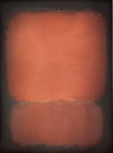
One evening in 1968, Mark Rothko regaled the art dealer Arne Glimcher, who had dropped by his studio on his way home from Pace Gallery in New York, with the story of a visit from a collector that day.
Pointing to an enormous painting of dark blue and black rectangles floating on a deep burgundy field, Rothko, the Abstract Expressionist painter, described offering his work to the woman, who had been pestering him for a canvas. “Mr. Rothko,” she had said with disappointment, “I want a happy painting, a red and yellow and orange painting, not a sad painting.” Amused, Rothko had responded: “Red, yellow, orange — aren’t those the colors of an inferno?” The woman left empty-handed.
The memory of this exchange now has inspired an exhibition that Mr. Glimcher hopes will “disprove the prevalent interpretation” by many critics, collectors and viewers that Rothko’s brilliantly colored paintings of the 1950s were sunny and joyous, while his darker-palette works in the 1960s reflected his progressing depression and foreshadowed his suicide in 1970. “There wasn’t a dichotomy,” Mr. Glimcher said. “Mark said many times he felt that tragedy was the only theme noble enough for art.”